

Troubleshoot your electronic devices
SmartManual is a mobile assistant that helps people fix their electronic devices without digging through long, confusing manuals.
By combining smart product recognition, manual‑grounded AI answers, and an accessible guided flow, it turns “I have no idea what to do now” into clear 1‑2‑3 steps that anyone can follow.
PLATFORM & TOOLS
Product / UX case study · Mobile experience
TIMELINE
Aug 2025 – Dec 2025
ROLE
End to end solo designer / UX research/ interaction design / tech orchestration
the Challenge
One of the first things I did was ask people around me a simple question:
Do you actually use the product manual ?
In my small informal poll, about 87% of people said “no".
Most people glance at them once, leave them in the box, or throw them away on day one.
Yet every time we buy a new device, we’re handed another booklet that quietly turns into trash.
Later, when something breaks, they’re on their own.
They jump between Google, YouTube, random forums, or just give up
As I dug into the problem, I saw the same pattern over and over:
manuals are technically complete, but practically unusable.
They’re:
-
Hard to find
-
Hard read
-
Hard to act on
That’s when I set the core challenge for this project:
What would it look like to fix the product manual
so people actually want to use it when they’re stuck?
my role
I led the end‑to‑end design of Handy between September and December 2025 as an individual graduate project, owning the problem framing, product definition, and core troubleshooting experience.
In addition, I conducted all of the research, interaction design, and prototyping myself, while collaborating with my faculty advisor and classmates for critique, and built the working app prototype myself using vibe coding with Lovable. I implemented the core flows and wired them to a live backend orchestration.
constraints
Handy was built as a 3 month capstone project, which meant I had to be very strict about scope.
There wasn’t enough time to design a “universal” solution for every product category, so I focused on electronic devices I could realistically support within the semester.
I also worked solo end-to-end. That meant every new decision had an opportunity cost. I had to constantly choose “what will teach me the most and move the product the furthest” rather than “what would be nice to have.”
On the technology side, the goal was a realistic, working prototype that proved the concept, not a production-ready system.
Research & Insight
I started by asking a simple question:
“If manuals are so bad, what actually works and for whom?”
To answer that, I first looked at existing research, then talked to real users to see if it matched their reality.
What I learned from existing research
Studies showed that:
-
People skip manuals not just from laziness, but because of overconfidence and lack of time.
-
Digital manuals only help when they add search, step-by-step interactivity, and visuals—a PDF on a screen isn’t enough.
-
Older adults are hit hardest by small fonts, jargon, and unclear diagrams, and benefit from large text, simple steps, and visual/voice support.
This told me solution couldn’t just “show manuals better.”
It had to transform how that information is delivered.
What I heard from real users
To ground the problem in real behavior, I ran 4 informal 1:1 interviews
-
2 younger, tech-savvy users
-
2 older or mid-tech users
Young tech-savvy users
Manuals are slow and outdated."
-
Younger, tech-savvy users told me they never start with the manual. They go straight to Google, YouTube, or forums.
-
Manuals feel slow, outdated, and “too much reading for one tiny answer.” They want fast, searchable, visual help that matches the exact device in front of them.
Older adults
I try to read it, but I get lost."
Both groups had the same core problem :
they couldn’t quickly get a clear, trustworthy path to fix their issue.
-
Older adults had a different story. Many try to read the manual, but run into small text, dense pages, and unclear diagrams.
-
They often don’t know if they’re “doing it right,”
-
And when they get stuck, they hand the device to a family member. Some also feel overwhelmed by online results.
Problem statement
As I dug deeper into both research and interviews, one thing became clear:
the information people need already exists, it's just not delivered in a way they can actually use.
When a device breaks, users don’t want a 50-page document.
They want one clear path:
“What is my device, what is happening, and what do I do now?”
But today's manuals fail at that moment of need.
So I set out to solve a more focused problem :
Users who struggle with troubleshooting their electronic devices need a manual-grounded, ai-powered assistant that can identify their exact device and walk them through short, step-by-step fixes, because they want clear, trustworthy answers without digging through long, complex manuals.
defining success
Before I started designing screens, I asked myself:
“If troubleshooting with Handy felt perfect, what would that look like?”
In that ideal world, a user would open the app, recognize their device in seconds, describe what’s wrong in plain language, and get one clear, trustworthy path to fix it—without bouncing to Google, YouTube, or a family member. No hunting through PDFs, no guessing, no “I’ll just live with it.”
To work backwards from that vision, I defined a few concrete signals of success:
Time to Answer
How quickly someone can get from “something’s wrong” to a usable first answer.
Time to Ask
How much friction there is before users feel ready to ask the AI their first question.
Findability
How easily they can get to the correct device and model, whether by scan or search.
Drop-offs
Where people give up during device selection, during the first answer, or mid-steps.
Users
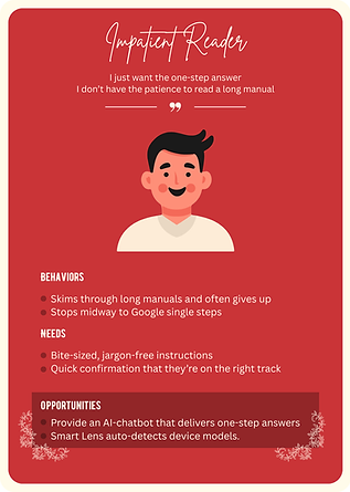
One of the hardest parts of Handy was that I wasn’t designing for a single “average” user.
I had younger, tech-savvy people who move fast and hate friction, and older or mid-tech users who need clarity, reassurance, and time. I couldn’t optimize for one without breaking the experience for the other.
To make this more concrete, I mapped my research into a few archetypes instead of generic personas:


User Journey map
This journey map visualizes how users move from noticing a problem with their device, through frustration and search, to finally getting a clear, step-by-step fix with Handy.

service blueprint
This blueprint maps the full service layer of Handy.

Introducing Handy
With the problem and success criteria clear, I shaped all of this into a single product idea:
An assistant that troubleshoots your electronic devices, step by step.


Troubleshoot your electronic devices
Smart Lens
Just point your camera at your device and Handy does the rest.
It reads labels, matches shapes, and narrows down the brand and model so you don’t have to type “that white Samsung microwave with the round handle” into Google ever again

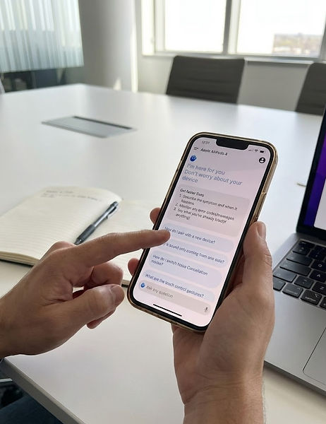
Manual based ai chat
Ask Handy what’s wrong in your own words and get a short, structured answer, not a wall of text.
Behind the scenes, Handy pulls from official manuals and support pages for your exact model, then turns that into a TL;DR, numbered steps, and simple “Check” confirmations.
You get the reliability of manufacturer documentation, without having to open or search a single PDF.

Accessible Guided Flow
Handy organizes devices in a way that feels human: Category → Product → Type → Brand → Model, with smart suggestions and cross-tags to catch typos and near guesses.
Each screen asks you to make one simple choice at a time, so even complex products feel manageable.

Design principle
To keep these pillars coherent, I defined a few simple design principles for Handy :
-
Short first, details later
-
One step = One action
-
Always a next step
-
Grounded in manuals, not vibes
-
Accessible by default
These principles became my filter.
Whenever I made a design or tech decision, I checked it against a simple question:
Does this get someone closer to a clear, manal- grounded fix in as
few, understandable steps as possible?"
Core experience
I designed Handy around a single moment:
“Something’s wrong. What do I do now?”
From that point on, the app’s job is to get users from confusion to a clear, believable first step as quickly as possible without asking them to already know model names, error codes, or the right keyword to search.
flow 1 : smart scan
Scan
Points the camera at their device. Smart Scan narrows down the likely models.
device confirm
Confirm your device from Handy's Smart Scan results.
ai chat
The experience pivots to Manual Based AI Chat.
In the most common flow, a user opens Handy, taps Scan and find their device immediately.


flow 2 : When scan doesn’t work
Search
It shifts into a guided picker using :
Category → Product → Type → Brand → Model
ai chat
The experience pivots to Manual Based AI Chat.
Not every device scans cleanly, and not every manual is available. For those moments, I designed a second core flow: search first, then ask.
Here, users start by browsing or searching through the taxonomy—category, product, product type, brand, product code—until they recognize their device.


Key design decision
As I iterated on Handy, a few design decisions ended up shaping the product far more than individual screens.
1. Finding the right device
Very quickly, I realized the biggest bottleneck in Handy wasn’t the AI’s answer quality.
It was how long it took to even get there.
f users stumbled here "Time to answer" exploded, and the whole promise of fast help fell apart.
So I set out to aggressively shrink this pre-AI part of the journey.
1) Starting with Smart Scan
My first move was to offload as much work as I could from the user.
If Handy could recognise the device from the camera, they wouldn’t need to remember model names or type long queries.
But that immediately raised a harder question:
What happens when Smart Scan doesn't work?
Bad lighting, worn labels, older models, or unsupported devices meant I couldn’t rely on scanning 100% of the time.
2) When manual selection becomes a maze
I needed a manual path to the right device that didn’t feel like a punishment or a maze.
The most obvious starting point for manual selection was :
-
Category
-
Brand
It looked simple on paper, but in testing it fell apart.
People ended up scrolling through long, flat lists, unsure where their device belonged or how the brand classified it.
I realized that fewer steps wasn’t the same as less friction.
3) Building a clearer taxonomy
To fix this, I stepped back and studied how electronics are organized in the real world:
-
Brand sites : how they group products and expose manuals.
-
Retailers : how they break down categories so everyday users can find what they need.

Brand site

Retailer site
What I learned was that all of them used multiple, more specific steps, not just one big jump.
So I reworked Handy’s flow into a deeper but clearer path:
-
Category
-
Product
-
Product Type
-
Brand
-
Product Code
Before
after


This allowed users to first recognize what kind of thing they were dealing with, then narrow down into more precise types and brands, and finally into the exact model.
I sketched the initial taxonomy myself, then used AI to help fill gaps and normalise labels.
The result was more steps on paper, but in testing it felt simpler, because each decision was smaller, more concrete, and often supported by images.

_edited.jpg)
First Taxonomy
2. Avoiding the blank chat problem
In my first prototype, the chat opened as a big empty screen with a text box at the bottom, very standard AI UI. On paper it looked clean. In testing, it did the opposite of what I wanted: almost everyone hesitated.
They stared at the blank input, rewrote sentences, or just froze.
Time to ask quietly inflated, and with it, Time to answer.
To fix this, I turned the “empty” state into guided onboarding for the conversation.
1) Added a small helper card
This gave people a very concrete recipe for what to say, without forcing them into a rigid form.
It also nudged them to share information the AI actually needs to give a good answer.
2) Introduced suggested questions
I introduced suggested questions that are grounded in real behavior.
For each device, Handy surfaces one-tap prompts based on:
-
Common questions pulled from manufacturer FAQs and online help content
-
Patterns in Handy’s own usage data about what people most frequently ask for that type of device.
Once the chat offered how to ask and real, data informed example questions,
Time to ask dropped, and the conversation felt less like typing into an empty AI box and more like picking up a thread that Handy had already started for them.
Before

After

3. Making AI answers actually usable
Once people found their device and asked a question, another problem showed up:
the AI’s answers looked impressive, but they didn’t feel usable.
In the first version, responses came back as long paragraphs, smart-sounding, but dense.
To fix this, I stopped thinking of the answer as “text” and started thinking of it as a script for action.
I restructured every response into a simple pattern:
tl;dr
A one–two line summary of what’s likely going on.
Numbered steps
Short, imperative actions like “Press…”, “Check…”
check cues
Tiny checkpoints that tell users what they should see if the step worked.
visual support
Images or callouts when a step is hard to follow with text alone.
Structured AI Answer


4. Designing honest fallbacks instead of dead ends
Even with Smart Scan and a better taxonomy, there were still the ugly edge cases:
old devices, damaged labels, blurry photos, or manuals that simply weren’t available.
In the earliest versions, when scan and search both failed, Handy more or less shrugged.
Testers told me very clearly, “If even this app gives up, I’m done.”
I realized that for Handy to feel reliable, it couldn’t just work well when things went right,
it had to actively help when things went wrong.
At one point, I explored adding a separate “helper AI” just to walk users through finding their model code, but it quickly became too meta: another mode, more back-and-forth, more confusion.
So instead, I designed a simple but concrete fallback:
a “Where to find your model code” screen that appears when Handy can’t confidently match a device.
Once the user selects a category and product, Handy shows:

Image
Pointing to where the label is usually located

Instruction
A short, device-specific instruction
tech
I didn’t want Handy to live only in Figma, so I built a working prototype with a real AI pipeline behind it.
At a high level, Handy’s prototype is stitched together from 3 main pieces :

LOvable
Where I vibe-coded the actual app

n8n
The orchestrator that receives the user’s question and device context, calls external services, and shapes the final response

google apis
Used to locate official manuals, smart scan, support pages for a given product on the web

Lovable Code

n8n AI Structure
Prototyping & testing
Paper Prototype
low fidelity
high fidelity
App
I began with paper sketches, mapping the core journeys.
From there, I moved into low-fidelity wireframes, focusing only on layout, hierarchy, and flow no branding, no polish.
Once the structure felt solid, I created high-fidelity screens with the actual visual language of Handy—colors, typography, icon style, and the character of the AI assistant.
Finally, I brought everything into a working app prototype in Lovable, wiring up real flows end to end:

Paper Prototype

Low fidelity

High fidelity

App
testing with real people
With the core app flow in place, I shifted focus to how people actually used it.
I ran lightweight usability sessions with two main groups, total 6 participants :
-
3 younger, tech-savvy users
-
3 Older or mid-tech users
I used a Wizard-of-Oz approach in early tests:
behind the scenes, I manually simulated Smart Scan and AI responses, while participants interacted with Handy as if everything were live.
These sessions directly led to the key design changes described earlier:
a deeper but clearer taxonomy for finding devices, guided how to ask tips, real-data-based suggested questions, and a structured answer format that people could actually follow in front of a real device.
Final Test
impact
Even though Handy is still a prototype, testing it with real people showed me how much difference a better troubleshooting flow can make—not just in UI, but in how confident people feel around their devices.
Faster path to real answers
Across sessions, people spent far less time wandering before getting help.
Instead of bouncing between Google, YouTube, and random guesses, most participants were able to:
-
Find their device inside Handy.
-
Ask a clear first question
-
reach a meaningful, model-specific answer
without ever leaving the app.
More confidence, especially for older users
For older and mid-tech users, the biggest shift wasn’t speed, it was confidence.
The combination of :
-
A guided way to find their device
-
Concrete tips on how to ask
-
Clear and numbered steps
made them more willing to try things themselves instead of immediately handing the device to a family member. Several participants described Handy as “like having someone next to me telling me what to do, one by one.”
A reusable blueprint for manual-grounded AI
On the product side, Handy now serves as a blueprint for how a manual-grounded assistant could work:
-
A taxonomy that scales across brands and product lines
-
A pipeline that attaches AI answers to real manuals
-
Patterns for structuring troubleshooting
what's next
One thing became very clear while working on Handy:
even the best manuals and AI pipelines won’t cover every weird edge case.
I want the next version of Handy to tap into that.
From solo troubleshooting to shared knowledge
My next step would be to add a community layer on top of Handy’s manual-based core.
The idea is simple:
-
Users can post what worked for them, add photos, and upvote helpful answers.
-
When Handy can’t fully resolve an issue, users can see real fixes from other people with the same device and similar symptoms.
-
Handy observes these patterns over time and learns from them, so common community fixes can be surfaced or summariㅋed in future AI answers.
This creates a loop :
_edited.png)
user
share
handy
learns
answser
improve
more users trust Handy
more peope
share
what's not build yet
Handy works as a real prototype, but a few important pieces are deliberately not fully built yet.
Manual-trained AI, not just “general AI”
Right now, Handy’s AI is guided and structured, but it is not yet trained on a full, dedicated corpus of product manuals across brands.
A future version would need a robust ingestion pipeline and high-quality manual corpus to truly become “manual-native.”
Automatic fetching of official product images
In the current prototype, many product images are still curated or static, not fetched automatically.
-
Handy doesn’t yet pull official product images directly from brand sites, retailer APIs, or structured open data.
-
There is no automated pipeline to search, verify, and attach the correct image to each device based on brand + model.
A future version would include a service that automatically discovers and links official product imagery, making the “find my device” flow even clearer and more scalable.
A complete device & manual database
Handy currently works with a limited set of devices and manuals for testing:
-
There is no comprehensive database covering all existing electronic devices.
-
Many brands, older models, and region-specific variations are not represented.
To scale in the real world, Handy would need a much larger device catalog + manual index, along with tooling to keep that data fresh as new products launch and old ones are retired.
reflection
Handy was the first time I truly worked end-to-end: research, strategy, UX, UI, taxonomy, and implementation.
I had to make trade-offs that weren’t just visual, but technical and content-driven, like choosing a deeper taxonomy because it actually made the flow feel simpler, or cutting features that sounded smart but added confusion.
It made me realize I enjoy sitting in that intersection between experience, information, and systems—where a design decision is not just “does this look good?” but “does this still work when we plug it into real data and real behavior?”
Some of my early assumptions failed pretty hard, and they turned into some of my most useful lessons.
From the failures, I learned that good interaction here isn’t about showing less it’s about showing the next right thing at the right moment.
If I had more time, I’d love to push Handy further into the real world larger tests, more devices, a real manual corpus, and that community feedback loop.
But even in its current form, Handy gave me what I really wanted from this project: a clearer sense of the kind of problems I want to solve, and the kind of designer builder I want to be.